Purplebricks wanted to update their existing mobile app which had been neglected by the business and basically made to just function exactly like the website. Which brought with it the question why should the App even exist.
The Challenge
Because the Purplebricks App was just a replica of website it didn’t give the user many reasons to download it besides the convenience of being an app. The fact the functionality was based on old version of the website didn’t help either. Our challenge was to realign the app to be a tool for signed up purplebricks customers to allow them to manage their property sale easily.
Research and Discovery
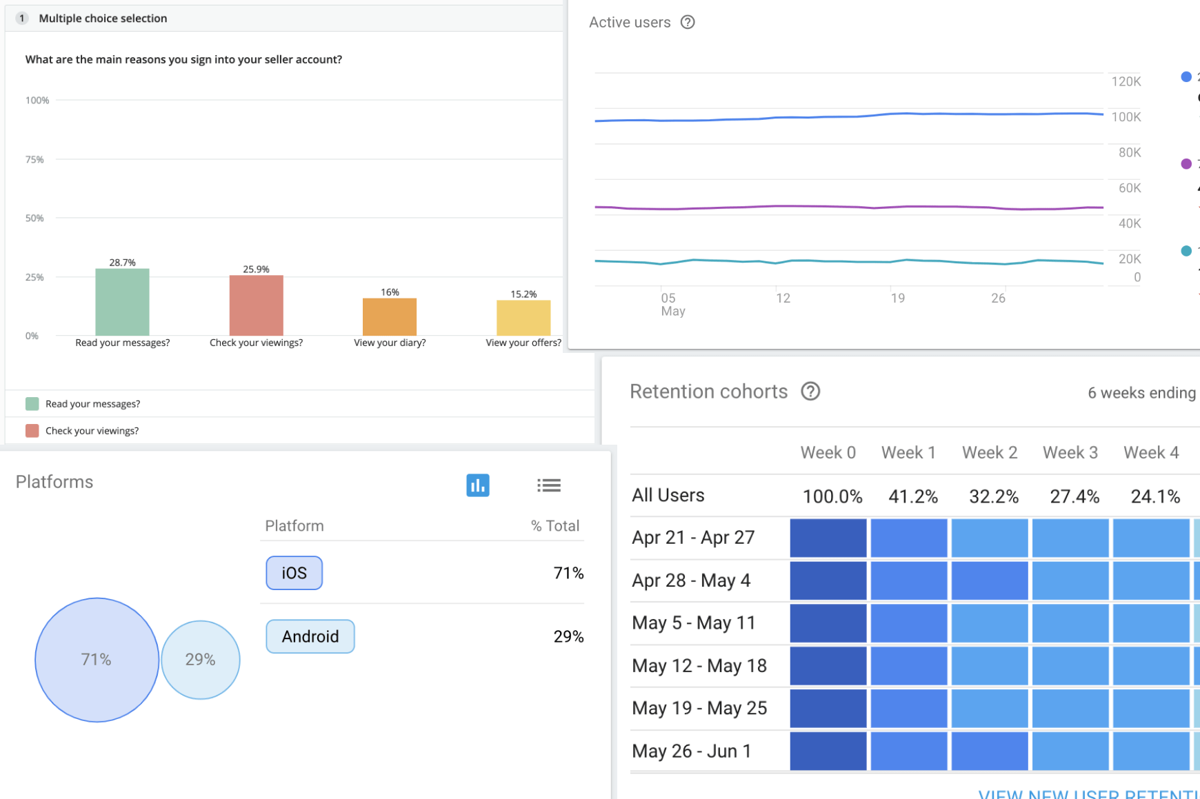
We had quite a lot of user data to work from which was captured using the existing app. This clearly showed that most users were already Purplebricks customers with a property to sell through Purplebricks. With that in mind, we mapped out typical user journeys including all touchpoints like adverts, the website and at what point in the journey a user would typically download the app.
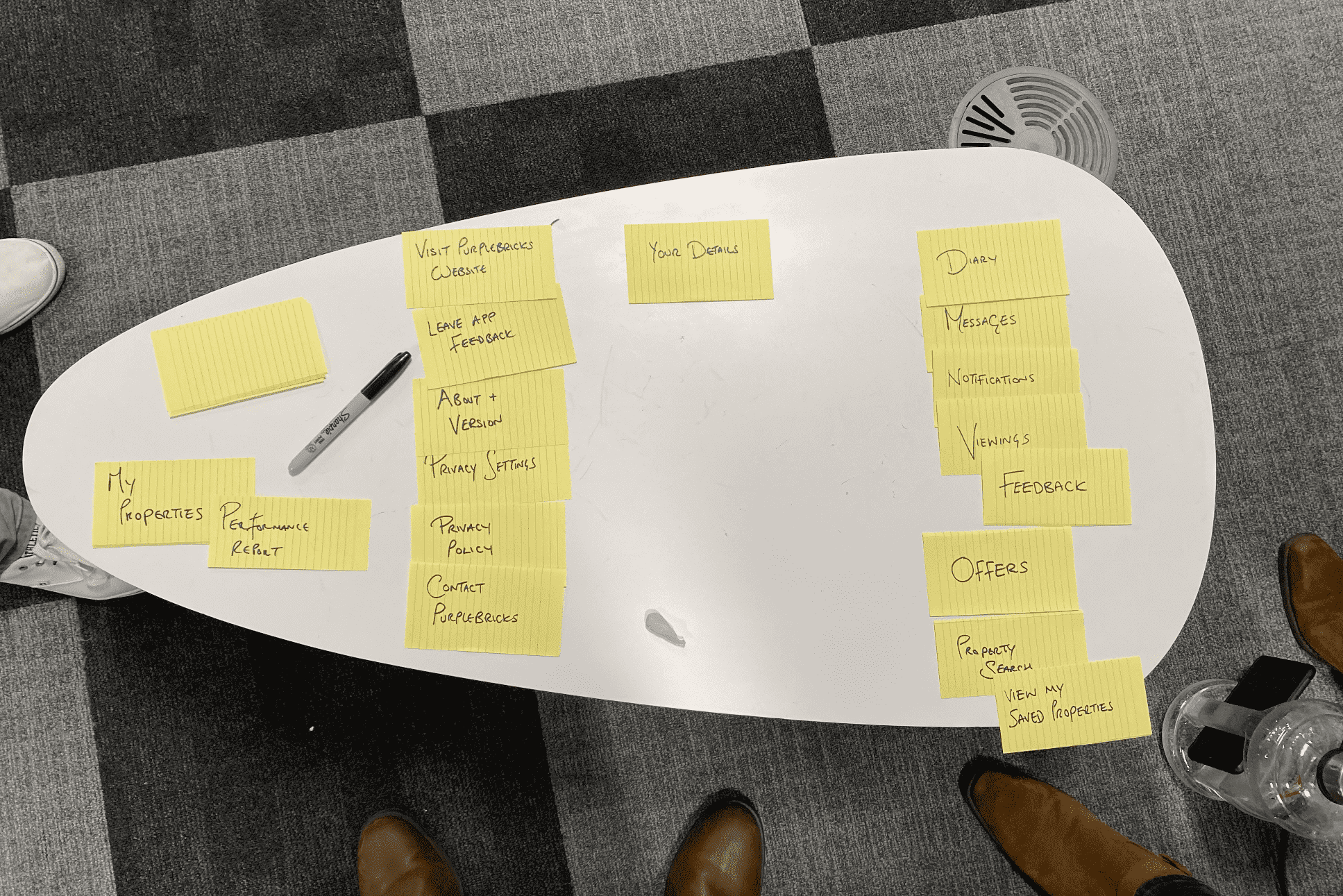
Workshops & Ideation
We ran a series of workshops to capture ideas around this seller tool theory and how might this work to compliment the existing user journey.
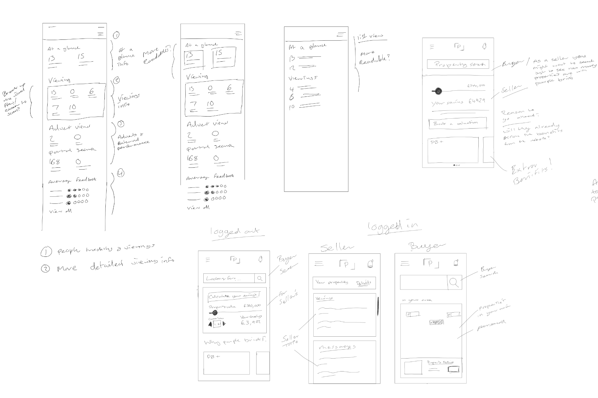
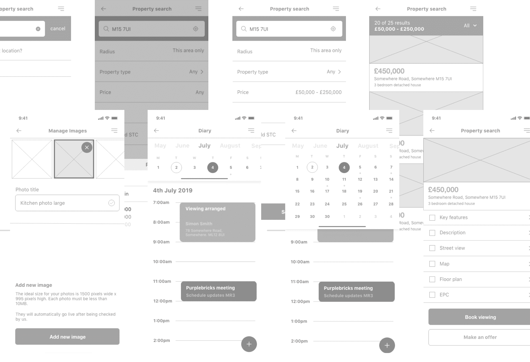
Wireframes and Prototypes
We created a lot of ideas around the ideal sellers companion app.
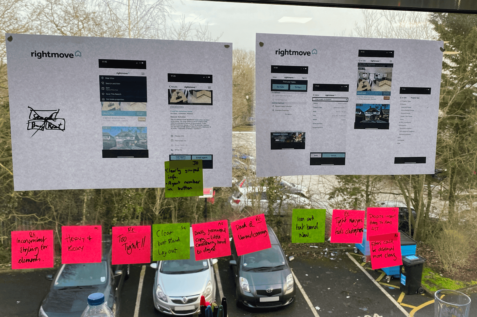
User Testing
We did quite a lot of online and moderated user testing to see if sellers and buyers felt the intended functionality and information would be useful to them.
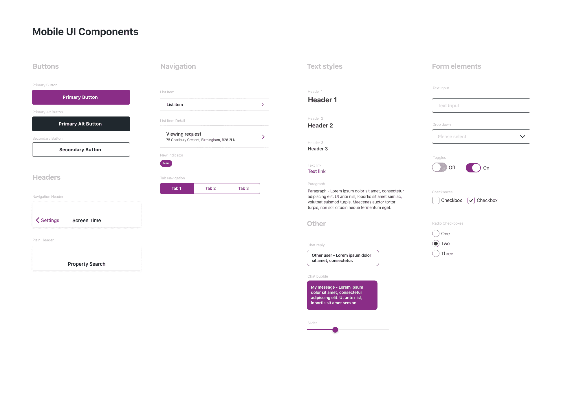
Design System
We created a whole new design system for the mobile app based on best mobile design practices and Purplebricks existing design standards.
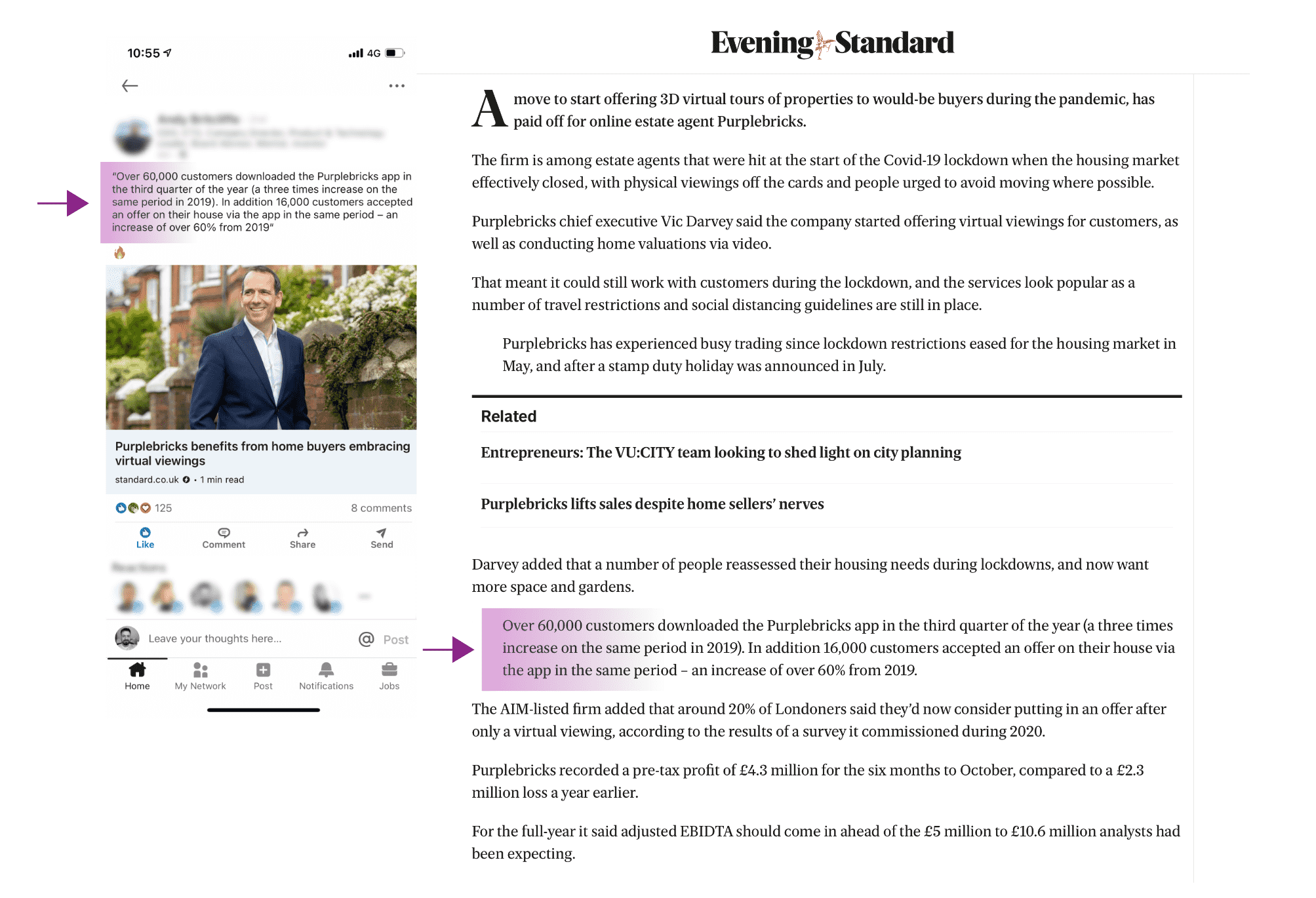
The Results
The team designed a modern mobile app experience aligned with how Purplebricks customers used and expected the app to function whilst still allowing potential customers to experience the app. As shown below, the mobile app’s usage grew substantially after the mobile team’s changes. The mobile app was intentionally promoted at the correct stage in a customer’s journey and the benefits highlighted for new users.